
Behind the Palette: How We Shaped PentalQuartz® 2027
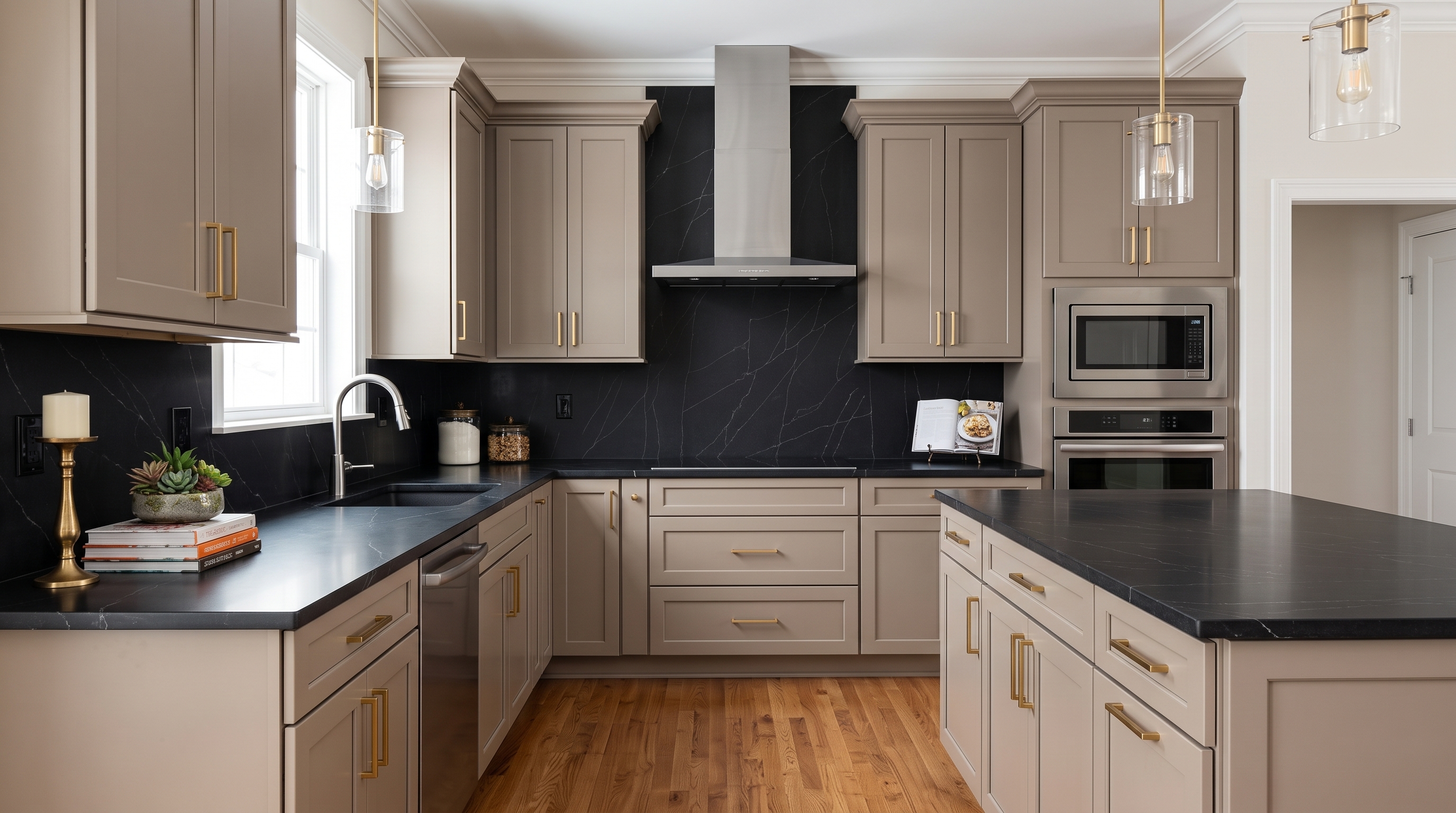
25 colors. Every one earns its place. Here's the story behind them.
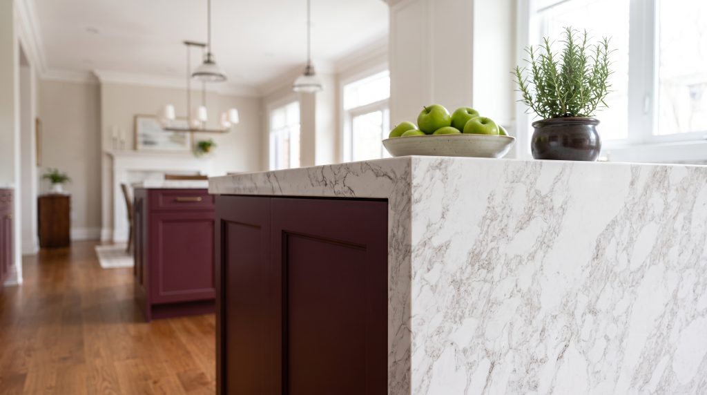
PentalQuartz® has developed a curated quartz palette based on the latest design trends, featuring the popular quartz countertop colors designers are most likely to use. This simplifies the selection process and ensures the surfaces specified work well in combination with each other.
Every color in a quartz collection starts with a decision. The 2027 PentalQuartz® palette reflects the thoughtful curation of each color, as selected by Joyce Beshada, our VP of Product. Joyce drew on her career in the surfaces industry, including the moments when the sheer number of options overwhelmed even her, to help guide which colors made the cut. Her perspective helped focus the collection from 80 colors to 25, with each one chosen to work for homeowners, designers and industry partners alike.
Read more about how these shared experiences shaped Joyce’s thinking, and how they guided the choices behind each color.
Introducing the 2027 Palette: 25 Quartz Countertop Colors
A curated quartz palette is about making the possibilities more meaningful. The 25 on-trend options in the PentalQuartz® Palette are not intended to limit choices. They’re about making each one count, so designers and homeowners can choose by style and character instead of sorting through endless samples. Here’s how:
- Curated Palette: Thoughtfully chosen tones for timeless interiors. From soft whites and warm neutrals to expressive veining and colorful blends, the 2027 PentalQuartz® palette brings together surfaces selected for their versatility, visual impact, and ability to complement today’s interiors. Every color was designed with purpose so it will work beautifully across more interiors.
- Made to Mix: Works beautifully across kitchens, baths, and beyond. A countertop can be a statement piece on its own. It can also complement colorful cabinetry, backsplash tile, flooring, lighting, plumbing fixtures, and hardware.
Each PentalQuartz® surface was selected with these considerations in mind, making it easier to create a cohesive material palette across statement kitchens, spa-like bathrooms, family gathering spaces, and other residential or commercial interiors.
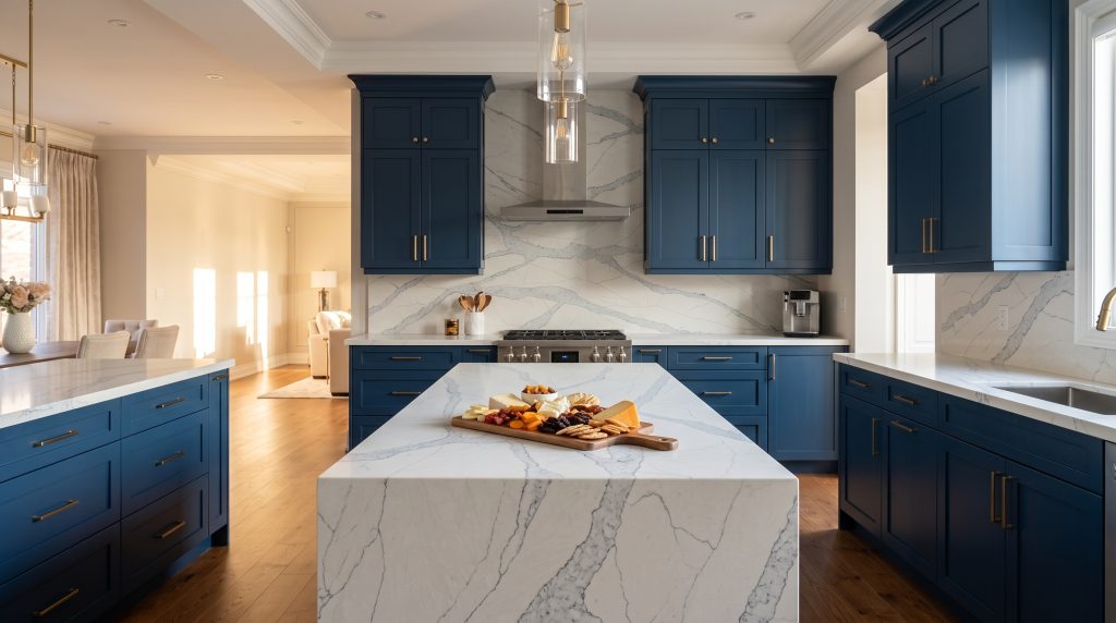
- Easy to Specify: Simple selection, sampling, and project support. A focused collection can make it easier to narrow down options, compare quartz samples, and confidently move from concept to installation. We tried to make trend matching easier, by including detailed information on each PentalQuartz® color page to help designers quickly understand the visual character of a slab before selecting. Details such as color type, vein pattern variation, looks, or even trend rating and suggested paint or cabinet pairings can help with design select for PentalQuartz®.
In Joyce's Words
Walking into the showroom
I’ve spent my career in this industry, and I remember walking into a customer showroom and spinning myself dizzy trying to count the brand towers. If it overwhelms me, I can only imagine how it feels for a homeowner choosing a countertop for the first time, or a designer trying to narrow the options for a client on a deadline.
Too many choices, not enough clarity
More options sound like a good thing. But when three whites are nearly identical, choosing isn’t creative. It’s exhausting. People second-guess, take home a stack of samples, and still aren’t sure they picked the right one.
So, I edited.
When I built the PentalQuartz 2027 palette, I started by cutting. We went from 80 colors to 25, and I chose each one to speak to everyone who walks through the door: homeowners, designers and our industry partners. That meant making sure there are colors, styles, and price points for everyone.
The range is still there, from warm to cool and quiet to bold. The difference is that every color earns its place. Each one also comes with a trend rating and suggested paint and cabinet pairings, so you can picture the whole room, not just the slab.
Exceptional design doesn’t come from endless choices. It comes from the right ones.
What's next
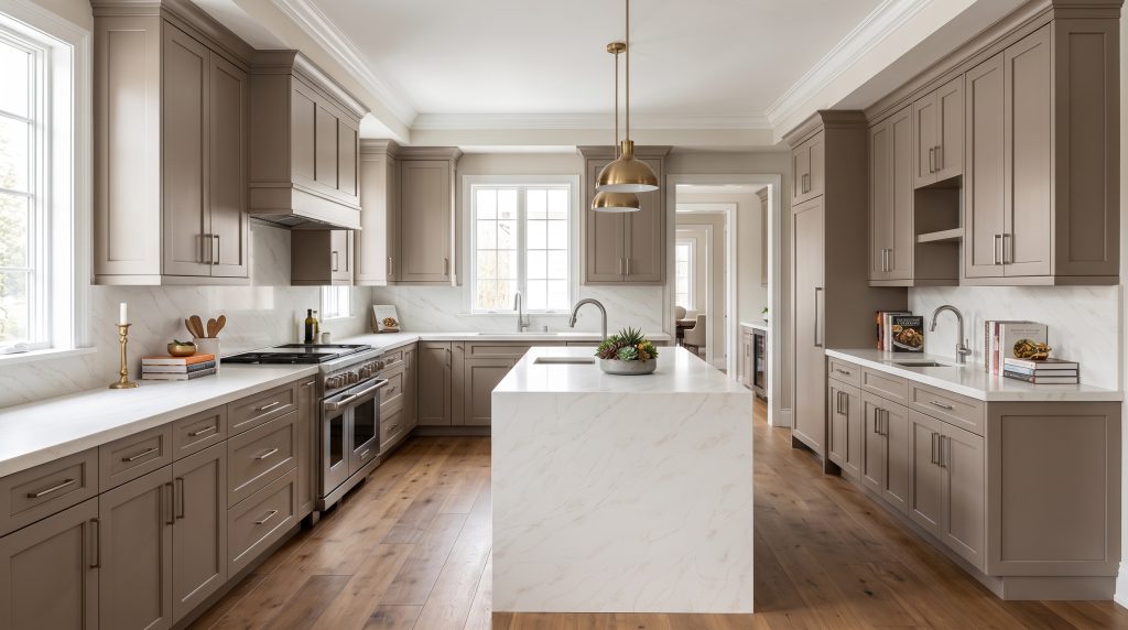
What comes next depends on you: the homeowner, the designer, and the fabricator. I’m listening, and I hear you. Your feedback helps shape every collection we bring to market, so the next surface you fall in love with may be one you helped inspire.
— Joyce Beshada, VP of Product
See the 2027 Palette
Ready to explore the new PentalQuartz® colors Joyce helped to curate? Visit your local showroom or browse the full collection on our website to see each color in your own light.
Frequently Asked Question
1. Why did PentalQuartz® narrow its palette to 25 colors?
Too many similar options can make choosing a countertop overwhelming. For 2027, the PentalQuartz® team edited the collection from 80 colors to 25. The full range from warm to cool and quiet to bold is still there, but every color now offers something distinct. The result is a palette that’s easier to navigate for homeowners, designers, and industry partners.
2. What quartz countertop colors are in the 2027 PentalQuartz® palette?
The 25-color palette is organized into four design categories to make browsing easier: Marble Inspired, Warm Neutrals, Bold Statements, and Colorful Blends. Every color also comes with a trend rating and suggested paint and cabinet pairings, making it easier to picture the finished space. [Explore the Palette]
3. Is a warm or cool white quartz better?
The right white quartz depends on the colors and finishes already in your space. Cool white quartz complements stainless steel, crisp cabinetry, and modern interiors. Warm white quartz pairs beautifully with natural wood, brass, cream, and other warm finishes. Each PentalQuartz® color page includes suggested paint and cabinet pairings to help you find the right match.
4. What quartz looks best with white cabinets?
White cabinets pair well with both complementary and contrasting quartz. White or softly veined quartz creates a bright, tone-on-tone look, while beige, taupe, or darker quartz adds striking contrast. To bring color into an otherwise neutral room, a bold statement or colorful blend like Adera can be a fun choice.
